
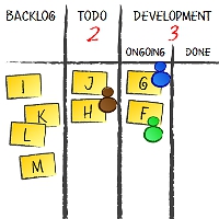
Given the fact that my most recent project is done for the client that lives in a galaxy far, far away (OK, just on the other end of Europe) an electronic Kanban / task board is a default. And yes, this means my heart bleeds as I’m an uncritical whiteboard lover.
It means that we’ve had a full whiteboard to use for different stuff and, as you may guess, it didn’t stay clear.
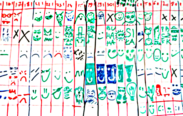
The big part of it is used for a happiness chart. The concept is very simple: everyone, at some point of every day, draws a happy / neutral / sad face in their row. The face refers to our general attitude toward the project during that day.
A typical question is how strictly we should treat “toward the project” part. Should issues unrelated to the project, or work in general, affect what we put in the happiness chart?
Hell, yes! Unless you are a robot and can fully isolate your private and professional lives. Interestingly enough, I know people who forget about their work in the very second they leave their workplace but I don’t know any that forget about their homes, families and friends when they enter it.
Now, should we fill the happiness chart at the beginning or at the end of a day?
Hell… um… it depends. We decided to do it at the beginning of the day or, more precisely, just after standup. This way we may consider it more a leading indicator than a lagging indicator. When a day has been good we likely see progress anyway. However, I would say that both approaches may work well. After all, you don’t look at the happiness chart in the context of a single day.
OK, fine, it seems funny but what can you learn from such a fuzzy tool?
A series of average-to-low moods from one person is an indicator that something is happening, either at work or outside. Either way a subtle inquiry may reveal a root cause and maybe open a couple of options of helping. If nothing else it gives you better understanding why someone is below their best.
By the way, one could say that if you all sit in the same room you will simply see this. Well, good luck with that. I’ve seen too many frustrated introverts, who look exactly the same as um… enthusiastic introverts. I’ve met too many very expressive extroverts, who seem to change their mood and attitude faster than you can track it. I don’t believe in “you will see it coming” any more.
By the same token you might understand better than one’s whining attitude is more of a pose than a real thing.
Another thing is looking for patterns. A complete set of low mood faces from the team simply yells “screw up, big time!” Something definitely went wrong. You may know it anyway but don’t take it for granted. In either case that’s definitely a call for help.
Especially happy set of faces tells a story about a major accomplishment even if it isn’t reflected at a task board. It might have been an especially painful blocker that’s just gone away or a risk that has been mitigated, etc.
Then, if you pay attention, you learn hell lot about what annoys people. Issues with video conferencing stuff, client’s presence at standup, scope being changed back and forth or what have you. You will hear such things being thrown into the air when people fill the happiness chart.
Given that you use happiness chart that looks a bit like calendar it also works great as planning tool. People can fill their planned days off. You can easily mark when the next retrospective happens, etc.
Finally, it’s fun to use it. The very first change that the team proposed was freedom in terms of what exactly is drawn on the board. The decisive thing is the color used (red for unhappy, blue for average, green for happy) but the picture may be pretty much whatever. After a week we’ve already had a devil, an angel, a Moomin (OK, it’s Groke), a pirate, a guy in a top hat, a giraffe, a cat… you already get it, right?
Our happiness chart became way more than simply a place where we mindlessly draw emoticons. It actually improves our moods a bit on the top of everything else I mentioned above.
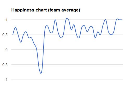
By the way, it you want to play a little game look at the chart below. It describes average mood of the team (only people present on any given day). The possible results are anything between 100% (everyone was happy) and -100% (everyone was unhappy). Now, guess what might have been happening in the project and what kind of progress we were making.
 Subscribe RSS feed
 Follow on Twitter
 Subscribe by email


7 comments… add one
In my experience, one of the most valuable things about using a team happiness chart is that it can be a leading indicator of process or interpersonal issues. A team’s average level of happiness tends to go down at least several days or as much as a week or two before the crisis of trust, communication, or expectation management would otherwise surface, somewhat more explosively. I’m glad to see the tool revived in Lunar Logic.
In my experience it works well if you have level of trust high enough for people to be honest about their mood. I’ve tried this for several weeks and finally gave up.
One of the problems we didn’t solve was changing moods throughout the day. I mean that if you ask people to draw their attitude towards a goal in the morning right after having great coffee and eating cookies it could be different than in the end of a day. Your option – just after standup – is kinda good. In my opinion it would still bias the mood of your team members because even though previous day was great, the standup could be boring, right? But if you search for a trend, than this should not be an issue.
Have fun with this tool :)
@Bartek – Everything tends to work better with high level of trust :) Anyway, I consider happiness chart a tool that gives a low-risk opportunity to express some dissatisfaction even in low-trust environments. I mean how bad can it be to show that I’m in mood (for whatever reasons).
Regarding the moment of a day when we fill the chart, well, if something big is happening a morning coffee won’t change that so much. If you expect, however, that a specific moment of a day may have big impact on what goes to the chart, choose one that is more neutral.
By the way, if morning standup is boring, no matter how great was yesterday it affects your mood for at least part of the day right? This is also something that I want to take into consideration.
Why not let the people wear flair buttons to show their mood?
@Don – If one needs to let people do such things I guess something might be wrong with their org ;)
Anyway, happiness chart shows the history and it is important. You rarely, if ever, watch at the data at happiness chart from a perspective of a single day.
Hi Pawel, what do you actually do with the chart? The chart tells you – something is wrong. But how do find out, WHAT is wrong? Do you go then to the peopele with the “unhappy smilie” and talk to them in a one to one? Or do you speek about it in your next standup? And last question: For which periode of time does it work?
@Friederike – Yes, I usually use a trick that I call talking with people ;) When something is wrong I want to find out. Ways of finding out aren’t really limited.
About the time span: well, usually 6-8 weeks fit the whiteboard and it’s more than enough as time span you may want to refer to. Then of course we start with a new chart…